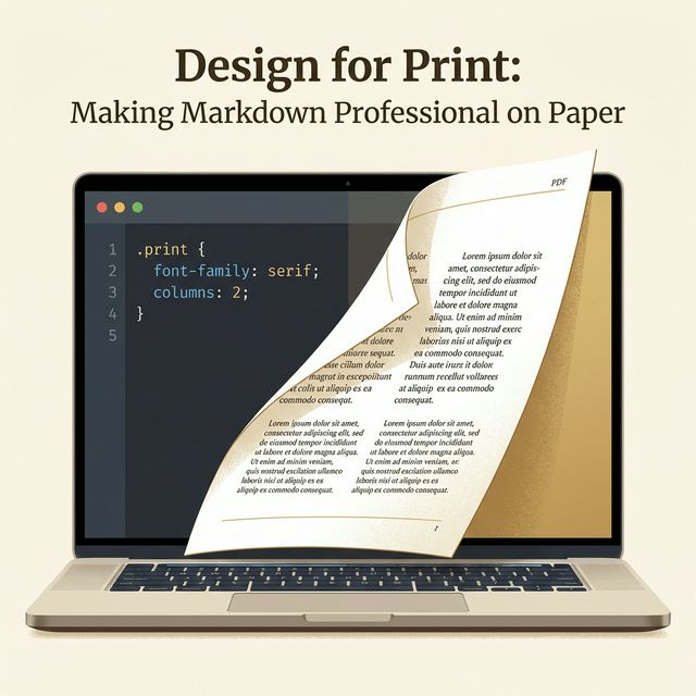
Design for Print: Making Markdown Look Professional on Paper (CSS for PDF)
We live in a world of infinite scroll. When we design for the web, we think in terms of "fluidity." Content flows like water into whatever container holding it—be it a massive 4K monitor, a vertical tablet, or a tiny iPhone screen. There is no "bottom" of the page, only more content.
But sometimes, you need to freeze that water into ice. You need a contract, a resume, a whitepaper, or an invoice. You need Paper (or its digital ghost, the PDF).
Suddenly, the rules change. Gravity applies. Margins matter. "Page 1" is distinct from "Page 2."
Most developers struggle here. They take their beautiful Markdown documentation, hit "Print to PDF" in Chrome, and the result is... tragic. Tables sliced in half. Headers lonely at the bottom of a page. Links that can't be clicked because it's printed on dead trees. Background colors disappearing.
This guide is about bridging that gap. It is about taking the simplicity of Markdown and applying the discipline of Graphic Design to create documents that look like they were made in InDesign, not Notepad. We are going to write code that controls ink.
Part 1: The @media print Query
The secret weapon in your CSS arsenal is the @media print block. This allows you to define styles that only apply when the browser (or PDF generator) is rendering for a page.
The first thing you must do is "reset" the web. Websites have navigation bars, sidebars, footers, and ads. You don't want those on your printed invoice.
@media print {
  nav, footer, .sidebar, .ads {
    display: none !important;
  }
}
This simple snippet strips away the user interface, leaving only the content. It is the first step in "Print Mode."
Part 2: The Typography of Ink
Screen typography and Print typography are cousins, not twins. They have different goals.
- On Screen: We want high contrast, sans-serif fonts (like Inter or Roboto) that are easy to scan quickly. We want generous line-height because looking into a lightbulb (screen) is tiring for the eyes.
- On Paper: We have reflected light. We can tolerate—and often prefer—Serif fonts (like Garamond or Merriweather). The "feet" of the letters help guide the eye along the line on a physical page.
When you are designing a Markdown-to-PDF pipeline, your first step should be to switch fonts. Don't print in Arial. It looks like a memo from 1999.
@media print {
  body {
    font-family: 'Merriweather', serif;
    font-size: 11pt; /* Yes, use pt for print, not px */
    line-height: 1.4;
    color: #000; /* Pure black saves ink and looks sharpest */
  }
}
Notice the unit change? On the web, we use rem or px. On paper, we use pt (points). 72 points = 1 inch. It is a physical measurement for a physical medium. 11pt or 12pt is standard for reading text.
Part 3: The Art of the Break (Widows and Orphans)
The single biggest enemy of generated PDFs is the Page Break. Computers are dumb. They don't know that a Header shouldn't be the last thing on a page. They will happily print "Chapter 1: Implementation" at the very bottom of Page 4, and start the text on Page 5.
This is called an "Orphan Header," and it screams "amateur."
To fix this, we need to enforce relationships between elements using CSS Break properties.
h1, h2, h3 {
  page-break-after: avoid; /* Glue the header to the next element */
  break-after: avoid; /* Modern syntax */
}

img, table, pre {
  page-break-inside: avoid; /* Don't chop these in half */
  break-inside: avoid;
}
The page-break-after: avoid rule is magic. It tells the printer logic: "If there isn't enough room for this Header AND the paragraph after it, move both to the next page." It ensures your headings are always attached to their content.
Table Handling
Tables are notoriously difficult. You never want a row to be split in half horizontally. By using page-break-inside: avoid on the tr element, you force the engine to keep rows integer.
Part 4: Handling Hyperlinks
Hyperlinks are a digital affordance. On a piece of paper, you can't click "Click Here."
If your document is meant to be printed physically, "Click Here" text hides the information. The reader can't see the URL. They can't navigate.
You have a sophisticated strategy available here using CSS pseudo-elements.
@media print {
  a[href^="http"]:after {
    content: " (" attr(href) ")";
    font-size: 0.8em;
    font-style: italic;
    color: #666;
  }
}
This turns [Google](https://google.com) into "Google (https://google.com)".
It automatically exposes the URL in parentheses after the link text, but only when printed. On the screen, it remains a clean clickable link. Ideally, you verify this works for external links but maybe exclude internal anchors.
Part 5: Margins and Bleeds
On a website, we often have "full bleed" hero images that touch the edge of the screen. On a home printer, that is impossible. Printers need a "grip area" of about 5mm where they can't print.
If you don't define margins, the browser will guess, and usually it guesses wrong.
@page {
  size: A4;
  margin: 2cm;
}

@page :first {
  margin-top: 5cm; /* Extra space for letterhead/logo on first page */
}
The @page CSS rule is powerful. You can define different margins for the first page (to accommodate a company logo) vs subsequent pages.
Part 6: High-Resolution Images
Screens are low density (usually 72-144 DPI). Paper is high density (300-600 DPI).
An image that looks crisp on a monitor might look pixelated and blurry on paper. If you are generating a PDF that will be printed, you need to provide high-resolution assets.
However, you don't want to load a 10MB image on the web version.
The srcset attribute in HTML allows you to provide different images for different contexts, but for simple Markdown conversions, the best trick is to use vector graphics (SVG) wherever possible. SVGs are resolution-independent. They are crisp at 72 DPI and crisp at 6000 DPI.
Part 7: CSS Frameworks for Print
You don't always have to write this CSS from scratch. There are specialized micro-frameworks designed specifically for making HTML look like paper.
1. Gator (Paged.js)
Paged.js is a polyfill that brings advanced print features (like running headers, footnotes, and page counters) to the browser. It essentially turns Chrome into a typesetting engine.
With Paged.js, you can define content that appears in the margin of every page:
@page {
  @bottom-right {
    content: counter(page);
  }
}
2. Paper CSS
This is a lightweight snippet that visualizes the A4 page layout directly on your screen. It adds a gray background and drop shadows to your "pages," so you can see exactly where the breaks will fall before you hit Ctrl+P.
Part 8: Debugging Your Print Styles
The hardest part of print design is the feedback loop. You change CSS, you hit Ctrl+P, wait for the preview, find a mistake, cancel, repeat.
Pro Tip: Chrome DevTools has a "Rendering" tab. 1. Open DevTools (F12). 2. Press Ctrl+Shift+P (Command+Shift+P) to open the Command Palette. 3. Type "Emulate CSS media type: print".
Now, your browser window behaves as if it is a piece of paper. You can see the margins, the hidden navbars, and the font changes in real-time without opening the print dialog. This saves hours of development time.
Part 9: The Future of Digital Documents
We are moving toward a "Document Object Model" where the distinction between a "PDF" and a "Web Page" blurs.
Imagine sending a contract that is a responsive web page on a phone, but prints as a legally binding, paginated PDF when sent to a signer. That is the power of Print CSS.
It allows a single source of truth (HTML/Markdown) to serve multiple form factors. You write once, you style twice, you deliver everywhere.
Conclusion
Creating a print-ready document from Markdown is satisfying. It feels like alchemy. You take a plain text file, run it through a build process, and out pops a PDF that looks like it cost $5,000 to design.
By respecting the physical constraints of paper—margins, page breaks, and typography—you can automate your entire reporting workflow. No more manual adjustments in Word. Just code into ink.